Galerie Mariska Dirkx

Een galerie ‘leeft’ van de keuzes die ze maakt. Mariska Dirkx heeft een feilloos gevoel voor glaskunst en andere objecten die ze in haar galerie presenteert. Door middel van atelierbezoeken door heel Europa proeft ze de sfeer van het atelier en wil ze alles weten over de gedrevenheid en passie van de betreffende kunstenaar. Die kennis geeft ze dan vervolgens met verve door aan verzamelaars en bezoekers van haar galerie. Zo bouwde ze door de jaren een schat aan kennis op, met name in de glaskunst, maar ook van kunstenaars die zich in brons, hout of andere materialen uitdrukken.
De galerie is gevestigd in het voormalige atelier van het vermaarde glasatelier Nicolas (opgericht in 1855) in Roermond (NL) waarvan Joep Nicolas de bekendste telg is. Hij heeft onder andere de gebrandschilderde ramen van de Oude Kerk in Delft gemaakt en heeft ook jaren in Amerika gewerkt. Polka Design werkt al sinds 1987 voor de galerie. Een leuk detail is dat de vader van Joep Pohlen –de eigenaar van Polka Design– bevriend was met Joep Nicolas. Zo gaat de tijd in elkaar over.
De galerie is een organische entiteit die zich voortdurend aanpast aan de tijd en de kunstenaars die er exposeren. Zo ook de publicaties die daar een reflectie van moeten zijn.
Naast de galerie organiseerde Mariska Dirkx ook 12 Biënnales, diverse andere tentoonstellingen en neemt ze deel aan presentatie’s met en over glaskunst.
Hoewel we nadrukkelijk geen huisstijl hebben nagestreefd hebben we door de tijd wel de tekening van een vruchtbaarheidsbeeldje uit Egypte uit ongeveer 4000 voor Christus bij tijd en wijle terug laten komen, voornamelijk in stationary drukwerk. Een passend symbool voor het werk dat Mariska Dirkx voor ‘haar’ kunstenaars doet.A gallery ‘lives’ by the choices it makes. Mariska Dirkx has an unfailing feeling for glass art and other objects that she presents in her gallery. By visiting studios all over Europe, she gets a taste of the atmosphere, the passion and motives of the artist involved. She then passes on this knowledge to collectors and visitors who visit the gallery. In this way, a wealth of knowledge has been built up over the years, particularly in glass art, but also of artists who express themselves in bronze, wood or other materials.
The gallery is located in the former workshop of the renowned glass studio Nicolas (founded 1855) in Roermond (NL) of which Joep Nicolas is the most famous member who also worked in the US and made for example also the glass stained windows of the old church (Oude Kerk) in Delft (NL). Polka Design has been working for the gallery since 1987. A nice detail is that the father of Joep Pohlen –owner of Polka Design– was a friend of Joep Nicolas. That’s how time flows into each other.
The gallery is an organic entity that constantly adapts to the time and the artists exhibiting there. So are the publications that have to reflect that.
Besides her work in and around the gallery Mariska Dirkx also organised 12 Biennials, various other exhibitions and participates in presentations with and about glass art.
Although we explicitly did not aim for a house style, we did let the drawing of a fertility statue from Egypt from around 4000 BC come back from time to time, mainly in stationary. A fitting symbol for the work Mariska does for ‘her’ artists.


‘These catalogues we designed and partly photographed the objects for, arrived on pallets with 1,000 A2 die-cut paper sheets each, ready to fold. We designed two of them with the same die-cut and then the enthusiasm for the handiwork really ran out.’


‘Mariska’s gallery is combined with the studio of sculptor and partner Dick van Wijk. This large-sized catalogue is showing mainly details of sculptures he made. On the last page, pictures of recent work can be glued in a grid, so that the catalogue can be updated with new work. The coloured paper has a fibrous tactile structure and the cover of black cardboard is screen-printed with Dick’s sketches. The catalogue is bound with a long stitch.’


‘An exclusive collection should have an exclusive presentation. The black folded sheet is printed with silver ink and serves as a cover for the various folders of selected artists Udo Zembok and Nabo Gass. As such, it is a small monograph. Therefore the word Mono is followed by the surname of the artist.’


‘A nice concept are also the small flyers that can be distributed en masse. Not only for the Biennials, but also for the separate presentations, such as during Tefaf Art Fair in Maastricht or the Glasstec Trade Fair in Düsseldorf, where Galerie Mariska Dirkx has a very large exhibition every two years. The flyers have become a rather large collection by now.’


‘A poster or a folder ... or both. One side a catchy picture of Mariska’s granddaughter Sorbonne, photographed by Joep Pohlen, and on the other side grid windows with artwork from the Gallery, Dick van Wijk and the Nicolas family, carefully designed from page to page, making ‘unpacking’ a feast.’


‘We usually try to keep our designs as clean as possible, but when it comes to jewellery, it always has to be a little bit more. Especially when the biggest piece, the huge royal signet ring made by Jens Gussek, is staying in our studio.’


‘19 artists having a dialogue in glass art on each spread in a catalogue as big as a postcard. It is staple bound, but this is not visible due to the fold-over cover.’


‘A recent colourful letterhead of the Gallery of 2021 and the first Dick and Mariska’s letterhead, made in 1991 with the necessary instructions for the printer. It shows Dick working in front of the large gothic window of the studio on the second floor. That part of the studio was later taken in use by the ever-expanding gallery.’


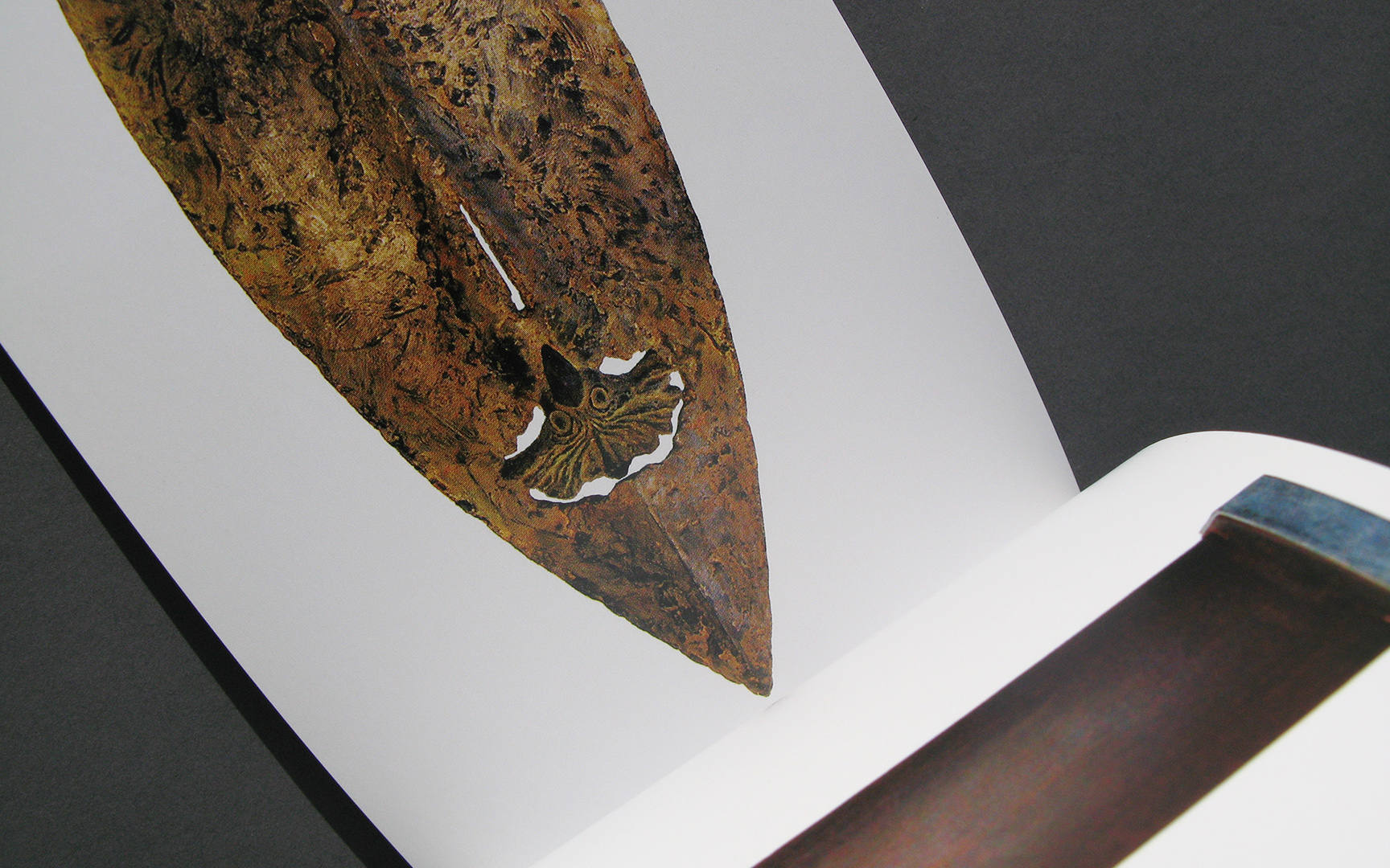
‘35 objects in a tiny catalogue. On the cover a detail of an art object by Josepha Gasch-Muche, made of broken glass screens from mobile phones.’


‘The Biennale in the former Carthusian monastery in Roermond of the Gallery had its own poster that could be folded in a A5 folder. On the back a selection of art work and a special drawn roadmap to find the gallery. Here a small selection of three posters is shown.’


‘For the sculpture exposition ‘ArtHentrich 01’ in the gardens of castle Groot Buggenum (NL) we designed an invitation that was also a poster (with an envelope) and a catalogue that had the same oblong size as the invitation and was printed in colour with an extra Pantone silver ink.’

‘A joint exhibition with the Stedelijk Museum (now Cuypershuis) in Roermond (NL) on three locations with the themes Glas04 and Meditations V. On the poster a direct link in the design to the sharpness and transparency of glass to leave to the quick viewer no doubt about the content of the message.’


‘Silencium – 3 x Western European Glass’ was the title of this first Biennale in the former Carthusian monastery in Roermond (NL). The mythical flying horse on the poster and the invitation symbolised the unexpected in art, the artist’s own view on the world surrounding her or him.’


‘The poster and catalogue of Mariska Dirkx’ first major exhibition ‘Door vuur gevormd’ (formed by fire) on a country estate in Lerop, just outside Roermond (NL). The poster was screen printed in 3 colours. For the catalogue and invitation, this poster was printed on the back in offset and cut into pages and folded. The catalogues were then perforated and bound by hand with a metal binder. As you can guess the print run was low ...’


