Open Universiteit

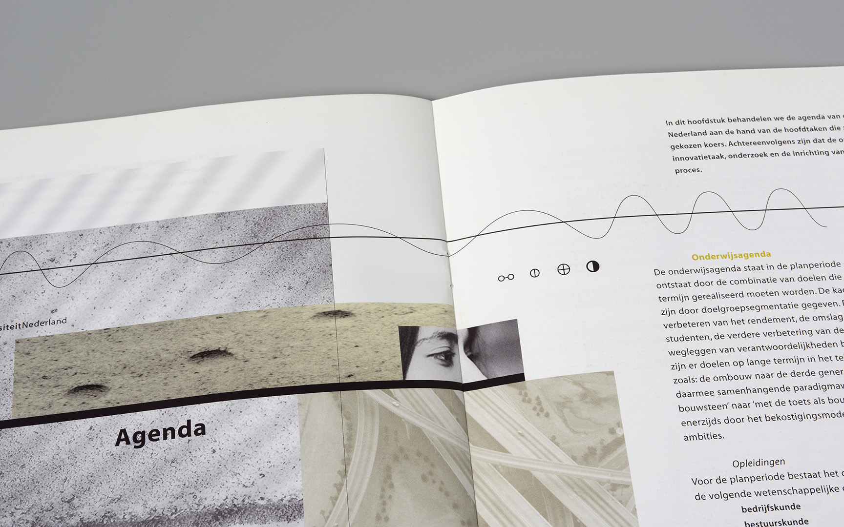
De Open Universiteit, een van de 14 universiteiten in Nederland, bedient zowel de Nederlandse als de Vlaamse markt met afstandsonderwijs op universitair niveau. De OU is opgericht in 1984 en kort daarna, in 1988, begon Polka Design, samen met de interne afdeling vormgeving, te werken aan de vele vorm te geven producten voor het onderwijs, maar ook voor werving van studenten. Daarnaast heeft de OU ook wetenschappelijke taken en taken op het gebied van innovatie van het hoger onderwijs. Het corporate logo in verschillende uitvoeringen is in eerste instantie ontworpen door BRS in Amsterdam en het tweede ook door opvolgers van dit bureau (Eden). Implementatie en toepassingen werden door de interne afdeling vormgeving gedaan en externe vormgevers zoals Polka Design. Projectlogo’s en specifieke logo’s die Polka Design heeft ontworpen voor de OU zijn onder andere Hoofdstad Weesp (samenwerking Teleac), Leven Lang Leren, Studienet, Schakelzone Recht, Netwerk Open Hogeschool, Celebes, Qourse, Consortium Innovatie Hoger Onderwijs.
De diversiteit van opdrachten door de tijd geeft dus geen strakke identiteit weer omdat ook veel samenwerkingen –onder andere met Teleac, Kennisnet, andere universiteiten en hogescholen– vroegen om een andere uitstraling dan die van de Open Universiteit alleen. De hier getoonde ontwerpen zijn een klein deel van alle opdrachten die we hebben gemaakt voor de Open Universiteit. In een aantal gevallen konden we ook een rol spelen bij het bedenken van copy, zoals bijvoorbeeld bij de marketingcampagnes.
Al met al is het een reis door de tijd maar ook een reis naar hoe de Open universiteit er nu uitziet. De hier getoonde ontwerpen van ons zijn een kleine weerspiegeling door die tijd.
The Open Universiteit (Open University), one of the 14 universities in the Netherlands, serves both the Dutch and the Flemish market with distance education at university level. The OU was founded in 1984 and shortly afterwards, in 1988, Polka Design started working with the internal design department on the many design products for education, but also for student recruitment. The OU also has scientific tasks and tasks in the field of innovation of higher education. The corporate logo in various versions was initially designed in 1984 by BRS in Amsterdam and the second by successors of this agency (Eden). Implementation and applications were done by the internal design department and by external designers including Polka Design. Project logos and specific logos that Polka Design has designed for the OU include Hoofdstad Weesp, Leven Lang Leren, Studienet, Schakelzone Recht, Netwerk Open Hogeschool, Celebes, Qourse, Consortium Innovatie Hoger Onderwijs.
The diversity of assignments over time does not reflect a strict identity because many collaborations –including those with Teleac (educational broadcasting), Kennisnet (education and ICT), other universities and schools for higher education– demanded a different look than that of the Open Universiteit alone. The designs shown here are only a very small part of the work we have made for the Open University. In a number of cases, we were also able to play a role in the creation of copy, such as in the marketing campaigns.
All in all, it is a journey through time but also a journey to what the Open Universiteit looks like now. The designs from Polka Design shown here are a small reflection of that time.


‘An early design was this cover for a course on Operating Systems. We thought an octopus would be suitable with a technical detail placed in the head to combine a living creature with the machine. Crayons (see the samples) provided the sea and tracing paper the edge around the octopus. The designer’s hand on the back accompanied our designs in those early days. The original artwork was put on film together with the text set on an early Mac, the proofs were printed and finally there it was in the real colour (there were no colour printers or colour screens back then). Of course, we first made a dummy that can be seen above that was cut and pasted with different materials and techniques. The text was simulated with a tiny brush with the Pantone colour mixed in gouache.’


‘A poster for the information day of the new course module about gen-food (genetically modified food) fitted exactly with our ‘From ... to ...’ campaign, for which we had previously created the concept and the pay-off. The A5 brochure ‘Biotechnology and food production’ promoting the new module matched the design of the poster.’


‘The educational technology expertise centre (Otec) is part of the OU. Their task is to find ways to optimize use of internet in education. To visualize that we designed digital structures that formed a second layer over real landscapes. The idea is that educational technology should not be perceived as interfering but should give you the freedom to study wherever you want.’


‘The Edubox brochure was based on the previously designed brochure for Otec. Edubox is an activity from Otec. Next to the brochure, a pocket folder was designed with a structure on the front that was laid over the veins of a leaf of a tree. The stationery is a derivative of this. As with the Otec brochure, we designed structures that were laid over photos for the chapter pages in the brochure which created an enormous depth to the pictures.’


‘The ‘Network Open Hogeschool’ (Network Higher Education) offers a second learning route in cooperation with schools for higher education. For the basic logo, we used Helvetica with added serifs and deleted parts. The logo can also be used in variations for the study programmes. Designs included brochures, banners, posters, website basic design, powerpoint templates and various other items.’


‘OI (OnderwijsInnovatie) is a magazine on innovation in education that we designed for the OU. We created weights from narrow to wide and from light to bold and everything in between with the Myriad Variable (MM) font for this magazine. We also created our own images by mixing stock images, our own photography, drawings and scanned material. This gave the magazine a special look and feel. After more than 20 years the last issue was published in 2020.’


‘The advertisements for the magazine OnderwijsInnovatie were also very recognisable. They only changed in colour and image. Usually, the images were taken by ourselves.’


‘If necessary, we also made customised advertisements in the magazine OnderwijsInnovatie for other events of the Open Universiteit. Sometimes with our own photos, like the girl walking down a side street of the Ramblas in Barcelona.’


‘We love experimenting with folding techniques and combining different paper stock to activate the reader and to insert different layers of information. This project actually includes three brochures. The first is a ‘simple’ brochure that can be given away separately, the second is a pocket folder in which the brochure is stapled and another brochure is placed in the pocket with data that can be updated in time. Complex to make (also for the printer), but when you have it in your hands quite intriguing.’


‘SchakelZoneRecht is a self-study programme for law students from schools for higher education to university. This transition zone is represented in the project logo by the squares. The programme is supported by both the Open Universiteit and schools of higher education, so it has a separate identity with its own website, brochures, posters and other communication.’


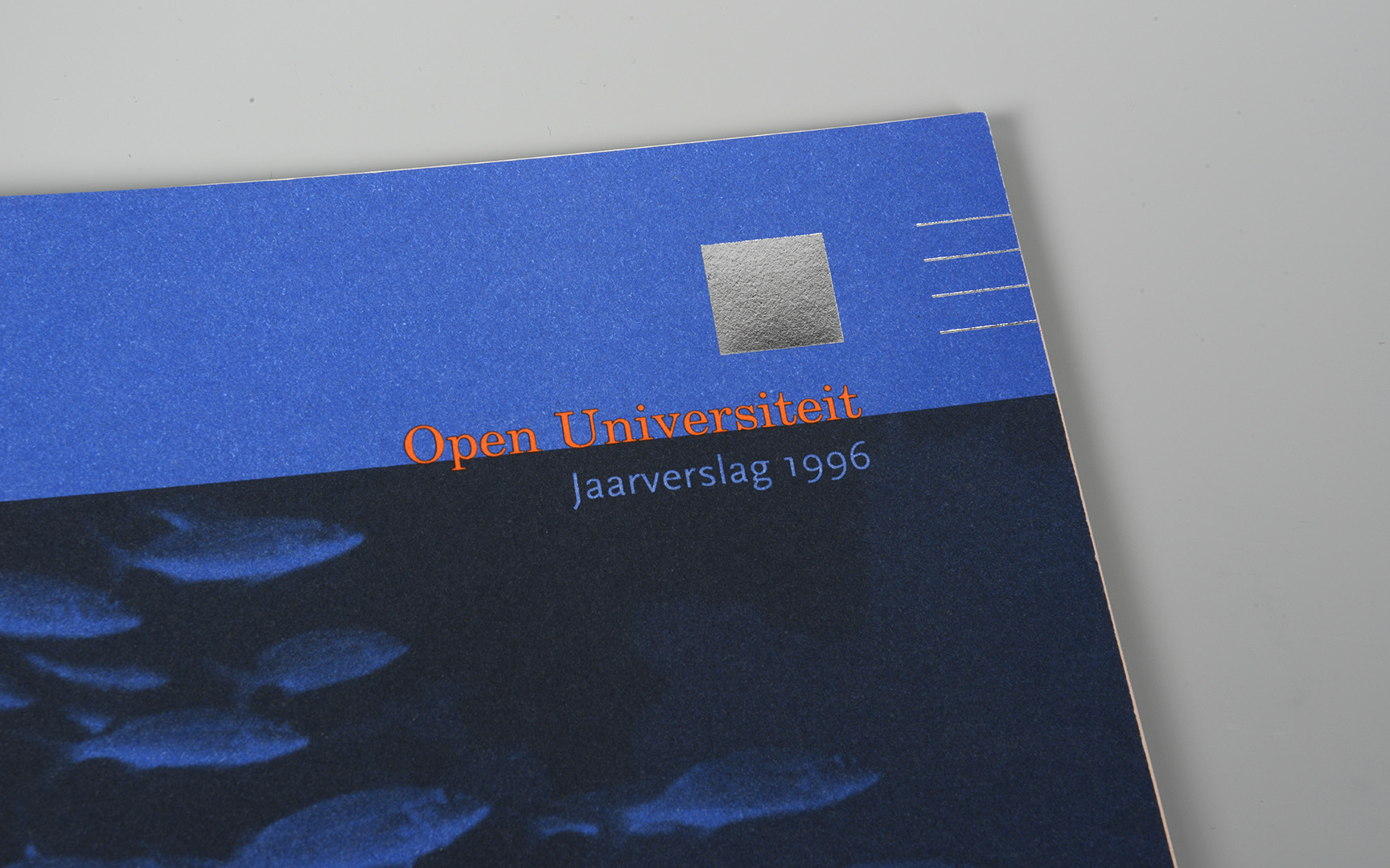


‘This annual report is printed in two Pantone colours on rough paper and has a very tactile feel. The foil-printed mirror on the front foreshadows the self-reflection that the content covers. The squares on the top right have a flip book effect that moves from a pixel image to a sharp image and then to the next image. This creates an interactive animation as you slide the pages through your fingers. The title and the theme ‘Forces in Change’ on the cover are visualised by the shoal of fish moving together in the same direction. On the chapter pages, we also used a self-invented code that fitted together and then formed an integrated line. So this annual report had a lot of layers ...’


‘Sometimes a design, with an image shown on the screen, can appear very simple. However, it does not show the richness of the actual printed product in this case. To ‘explain’ it in several images is a challenge. This brochure has a tracing paper cover in which a number of squares have been die-cut. The transparency of the cover reflects EduTransform’s ability to make hidden knowledge educationally accessible.’


‘With the ‘From ... to ...’ concept, we not only involved the upcoming student in this successful marketing campaign but also the OU staff, who quickly came up with ideas for how students could change their lives by education. With the pay-off ‘change is something you do yourself’, we capitalised on the DIY popularity of the time. ‘From Dreamer to Thinker’ was the basic slogan for the OU and ‘From Rebel to Magistrate’ for the Faculty of Law. Every faculty had its own slogans focused on large target groups but also for smaller ones when applicable.’


‘This logo was designed for the television series Hoofdstad Weesp (Capital or ‘Head’ city Weesp). The population of the town of Weesp is known as an average of the population of the Netherlands and is therefore often used to see how the inhabitants think about certain subjects. It is a television series of the educational broadcaster Teleac in the Netherlands in cooperation with the Open Universiteit about the psychology of everyday life.’


‘Invitations and programme brochures for the annual Dies Natalis and various symposia and seminars. Above a small selection. Some of the photos came from our own archives or were made for the publications (The ventilator on the cover of the first picture is the one in our studio and the ‘leg’ picture on the Cognition and Multimedia Design folder is a screen shot from Tarantino’s Reservoir Dogs). Besides invitations and brochures, PowerPoint templates were also designed and, for example, personalised badges.’


‘A poster for the Dies Natalis and a poster for the Student Day in Brussels. Posters as well as brochures and advertisements were designed with the same cover images for each of these events. Coincidentally, these two both had an upside-down design. We like it and continued with that now and then ...’

‘This logo was designed for the English courses of the Open Universiteit. An independent identity had to be developed for this activity, but the design had to be close to the house style of the Open Universiteit. The reference of the ‘ou’ for Open Universiteit in Qourse was subtle but present.’


‘A book we designed to celebrate the 15th anniversary of the Open Universiteit. Students of the OU can be found everywhere in our society. We took the photos in this book in our own surroundings, on the street, in shops, at home and while travelling. That is how we incorporated the everyday environment of the student to this book on distance learning.’


‘Some designs are exuberant and others are serving. Locus magazine belongs to the latter one and was focused on typographical detail and good readability. Irmin Visser, the editor at the Faculty of Arts and Sciences for Locus, did not rest until the last comma was in order and everything was consistent from the first issue in 1998 to the fortieth and last paper issue in 2017. Another subtle feature was the colour of the back of Locus. This colour was also used for the headlines and captions in the magazine. The picture of the binoculars on issue 8 was taken during our holiday in Florida that year. By the way: the meaning of the term ‘Locus’ is site or location.’


‘Celebes is a programme to give drop-outs a second chance. A large contrast in appearance with Locus magazine. It is a cooperation between secondary schools and the Open Universiteit. The logo represents a safe haven for the young people who, with guidance, can follow education and obtain certificates. Part of the assignment was a website, posters, stationary, certificates and a folder.’


‘The title of this catalogue is ‘Eigenwijs Talent’ (Cocky Talent) and it shows works of art by employees and students of the Open Universiteit. The catalogue is printed in black and white.’


‘Every year, new information brochures were printed for the seven faculties. And then there were the general brochures, Vademecum and a few other publications related to the new academic year. And although the content was more or less the same, it had to look different and new every year. For these editions we could also use again some of our own photography, including the trumpet players of the Sagrada Familia from our trip to Barcelona.’